

Together with project partners, Nuromedia has progressed to perform extensive evaluation of the needs of prosthetitians and other stakeholders and iterated the user interfaces (UIs) to best reflect their needs. The goal was to design a clear and quickly comprehensible design usable for all target groups. With the user feedback collected so far, the provisional design for SocketSense Software will be used for first prototype, while still being flexible to be improved upon further input and suggestions by healthcare specialists. As seen in the example below, we have followed a tabular UI approach offering quick access to the information of interest. This approach can be implemented as Web-Application as well as native Tablet application:
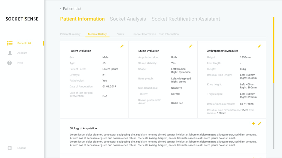
Figure 1 SocketSense GUI Mock-up
Good UI design in the healthcare system is even more vital than for other industries, because the medical information displayed has a greater and deeper impact. The stakes of comprehensible design and usability of the software are higher for medical software than for other conventional digital applications for example. The findings from general UI design also apply to the healthcare system. And these are clarity, consistency and minimisation of cognitive load.
Lack of clarity causes confusion for the user. Something that should be avoided with sensitive patient data. To have clarity in design you need a good coordination of certain elements. For example, the right choice of colour for a particular design of elements with the corresponding signal effect. Red, for example, should be only used for error messages. Well used contrast should bring important elements into the foreground and unimportant ones into the background. Similarly, a hierarchy in the size and arrangement of elements should be in order of importance.
Consistency in the presentation of the elements is equally important. Elements, buttons, diagrams, information windows should have the same appearance at all times to facilitate orientation. A deviation in the design should only be made with good reason, e.g. to illustrate a change in information.
Ultimately, all principles serve to minimize cognitive load while bad design choices increase the cognitive load. The goal can be paraphrased as ‘don’t make me think’ . Thinking is reserved for the actual medical and diagnostical work. Software is merely a tool in the medical field intended to support the actual work and make it easier. Not to slow down the actual work and letting professionals hamper with confusing overlays.
To ensure appropriate usability of the designed application, World Wide Web Consortiums (W3C) Web Content Accessibility Guidelines (WCAG) were considered.
As a parallel activity, the actual implementation of the SocketSense Software, including its backend functionality and data communication set up are progressing, with a goal to provide a tangible prototype in the coming months.